
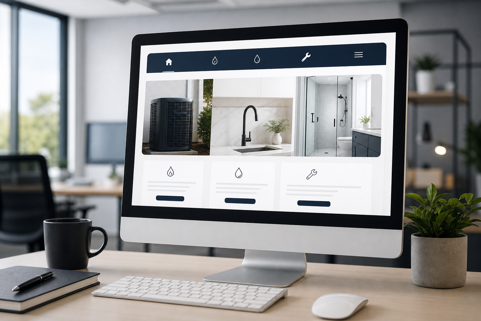
Slate Summary
Simplify your main menu to surface 3–5 core services, add a persistent contact method (click-to-call or button), and place a short contact form on each service page. Run a 5-task usability check and use analytics to prioritize fixes.
Why simple navigation matters for contractors
When a homeowner needs an emergency repair or a remodeling estimate, they want answers quickly. Confusing navigation makes visitors hunt for service pages, pricing clues, or contact details. That friction often turns an interested prospect into a lost lead.
For contractors, websites are not just marketing — they’re part of your dispatch and sales process. Clear navigation reduces calls to your office to answer basic questions, helps search engines understand your offerings, and shortens the path from discovery to booking. It is one of the foundational checks in a broader contractor website optimization review.
Common navigation problems contractor sites have
- Overloaded menus: too many items or vague labels like “Services” that hide what you actually do.
- Buried contact info: contact pages are hard to find or require multiple clicks.
- Generic service pages: pages that don’t clearly match what a customer is searching for (e.g., “Repairs” instead of “Drain Cleaning”).
- Missing persistent CTAs: no click-to-call button on mobile or no visible “Request a Quote” button. The action should match the visitor’s task, as outlined in this guide to clear contractor calls to action.
- Duplicate links and inconsistent labels: different pages use different names for the same service, which confuses visitors and search engines.
Core principles of clear navigation
-
Prioritize the customer’s goal
Lead with what they want: service details and ways to contact you. Think about the three most common reasons someone visits your site and make those options front-and-center.
-
Use clear, specific labels
Use plain language that matches how customers search and speak: “Furnace Repair” instead of “Heating Solutions.” Avoid company-internal jargon.
-
Limit choices
The fewer menu items, the faster users decide. Aim for 5–7 primary items. Group secondary pages under clear parent items.
-
Make contact immediate
Every page should make it obvious how to call, request a quote, or schedule service.
-
Keep the path to conversion short
Reduce steps between landing on a service page and completing a contact action (form, call, or booking).
Navigation and homepage hierarchy work together: the menu should help visitors reach the right page, while the homepage should make the primary service and next step clear. See how to structure a contractor homepage when the problem is not just the menu but the order and purpose of the page’s sections.
A practical navigation checklist for HVAC, plumbing, and remodeling
- Audit your current menu: write down each menu item and how many clicks from the homepage to the contact page.
- Identify your 3–5 priority services: these should be the most frequently requested or highest-margin services you want more of.
- Rename menu labels to match customer language: ask your office staff what customers usually say on the phone.
- Add service-level contact options: a short contact form or a “Request Estimate” CTA on each service page.
- Ensure mobile visibility: a click-to-call button and a condensed menu are essentials.
- Place a direct link to the contact page in the main menu and in the footer.
- Remove or hide pages that duplicate services or provide no clear value.
- Add breadcrumbs on multi-level pages so visitors always know where they are.
Designing the main menu: a recommended structure
Here’s a practical main menu layout you can adapt. Keep it simple and predictable.
- Home — quick introduction and primary CTAs visible immediately.
- Services — a top-level item with a short dropdown listing your core services (for example: Furnace Repair, Air Conditioning, Drain Cleaning, Leak Repair, Kitchen Remodel).
- Projects or Portfolio — real examples with photos and short descriptions.
- Service Areas — clear list of cities or counties you serve (helps local search and sets expectations).
- About — short company info, licensing, and safety/insurance details.
- Reviews — links to review profiles or a reviews page that highlights customer feedback.
- Contact / Request a Quote — make this the right-most item and keep the label action-oriented.
Why this works:
- Services listed in the dropdown let a visitor jump straight to the page that matches their need.
- Service Areas prevents calls from customers outside your zone and improves local SEO.
- An action-oriented contact label reduces hesitation and makes the next step obvious.
Make contact easy from every page
Contact is the conversion. Make it impossible for a visitor to miss.
- Persistent contact CTA: include a sticky header or floating button with “Call Now” or “Request Estimate.” Ensure it doesn’t block content.
- Click-to-call on mobile: every phone number should be tappable. Place the main phone number in the header and footer.
- Short contact forms on service pages: only ask for name, phone, address, and a brief description. Longer forms create unnecessary friction for a visitor who needs help. Use the estimate-form and service-request guide to test the full request path.
- Offer multiple contact methods: phone, short form, email, and a clearly visible scheduling link if you use online booking.
- Map and service hours on the contact page: visitors want to know if you cover their area and when you’re available.
Contact form best practices
- Use a clear headline and action button: “Request a Free Estimate” or “Get Same-Day Service.” Keep field labels plain.
- Reduce friction: use dropdowns for service type and allow optional fields for additional details.
- Tell users what happens next: e.g., “We’ll respond within one business day” — avoid promises you can’t keep.
- Track form submissions with analytics so you know which pages drive the most contacts.
How to test and iterate your navigation
- Task-based testing: ask a few real users (office staff, friendly customers) to perform 3 tasks: find pricing/estimate, find your service area, and find the contact page. Time how long it takes.
- Use analytics: look at pages per session, average time on page, and exit pages. High exits on service pages may mean the next step is unclear. Track calls, forms, and scheduled estimates separately using the service-business conversion measurement guide.
- Heatmaps and recordings: tools like heatmap recordings reveal where visitors click or tap — if they repeatedly click a non-link, consider turning it into a CTA.
- A/B test menu labels: try a small label change (“Contact” vs “Request a Quote”) and compare click-throughs.
- Iterate monthly: prioritize fixes that reduce steps to contact and measure the effect on inquiries.
KPIs to watch
- Contact form submissions and phone calls from the site.
- Click-through rate from service pages to the contact page.
- Bounce rate on service and homepage.
- Time to contact (how many clicks/time between landing and first contact).
A one-week action plan
Day 1 — Audit and choose priorities
- List current menu items and map the click path to contact.
- Identify 3–5 priority services to promote.
Day 2 — Simplify the menu
- Reduce top-level items to 6 or fewer.
- Rename vague items using customer language.
Day 3 — Add contact CTAs
- Place a visible “Request a Quote” or “Call Now” button in the header and a floating mobile button.
- Add a short contact form block to two priority service pages.
Day 4 — Mobile check
- Test the site on several phone models. Ensure click-to-call works and the menu is easy to use.
Day 5 — Test with users
- Ask three people unfamiliar with your site to find the contact page and a specific service. Note stumbling points.
Day 6 — Make fixes
- Implement the easiest high-impact changes found during testing.
Day 7 — Monitor and plan next steps
- Check analytics and set two KPIs to watch for the next 30 days.
Closing and next step
Clear navigation reduces friction, speeds up customer decisions, and turns more site visitors into real calls and bookings. If you want a prioritized list of navigation fixes for your site, take Slate Systems up on a free website audit. How easy is it for customers to find your contact page?