
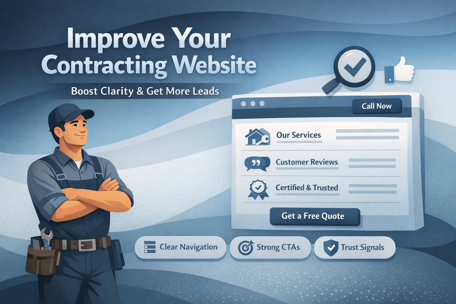
Slate Summary
A useful contractor website audit starts with the customer’s path: identify the service, confirm the service area, find credible proof, use the site on a phone, and complete a contact request. Fix issues that block clarity, trust, or inquiries before prioritizing cosmetic changes, then maintain the key paths on a recurring schedule.
How can you complete a useful contractor website self-audit in 10 minutes?
A useful contractor website self-audit starts with the customer experience, not visual preferences. Open the homepage and one priority service page on a phone before reviewing colors, animations, or other design details.
Set a 10-minute timer and review the site as a first-time customer. Without searching through every page, write down whether you can identify:
- The contractor’s primary service or services
- The locations served
- A reason to trust the business
- The next step for requesting help
Record each issue by page, customer problem, and priority. For example, note that the service area is missing from the homepage, that a phone number is difficult to tap, or that an estimate form does not explain what happens after submission.
Prioritize issues that block service discovery, trust, or estimate requests. Cosmetic changes can wait until customers can understand the business and complete a contact path.
Can a first-time customer understand what your contracting business does?
The homepage should quickly explain what the business does, where it works, and what a visitor should do next. A broad statement such as “quality service” does not identify the service or help a customer decide whether the contractor is relevant.
Review the main headline and the first visible section for useful specificity. A service and location combination is generally clearer than a general claim. Also check whether the page names the primary services you actively want inquiries for.
Confirm that the service area is written in terms customers recognize. Depending on the business, that may include cities, counties, neighborhoods, or a defined region. Keep the wording understandable and consistent with the locations the business currently serves.
The next step should also be clear. Use a direct action such as calling, requesting an estimate, or submitting a service inquiry. The wording should match the visitor’s likely intent instead of sending every visitor toward an unrelated action.
Ask someone unfamiliar with the business to review the homepage briefly and answer three questions:
- What services are offered?
- Where are they offered?
- What should I do next?
If the answers are unclear, revise the wording and hierarchy before adding more content. The guidance on homepage length and hierarchy can help when you are deciding which information belongs near the top of the page.
Does each priority service have a usable page?
List the services for which you want qualified inquiries. Then confirm that each priority service has a dedicated, working page rather than appearing only in a general service list.
A usable service page should help a visitor determine whether the service fits their situation. Review whether the page explains:
- When the service may be needed
- What the service includes at a basic level
- Which locations are covered
- What the process may involve
- How to request help
The page’s call to action should match the visitor’s likely intent. Someone reviewing an emergency repair page may need a clear call option, while someone comparing a planned improvement may prefer an estimate request or service inquiry.
Check related-service links as well. Include them when they help a customer choose the right path, but avoid adding links simply to fill space. For every priority service page, verify that a visitor can identify the service, intended customer or situation, service area, basic process, and contact option without returning to the homepage.
Can customers confirm that you serve their location?
Service-area information should be clear, consistent, and current. Check the homepage, relevant service pages, contact page, footer, and business profiles for conflicting wording.
Review the following details:
- Cities, counties, neighborhoods, or regions served
- Business hours
- Phone number
- Address or location information, when applicable
- Links to relevant business profiles
Remove outdated locations, old promotions, and references to areas the business no longer serves. A visitor should not have to call merely to confirm basic location coverage if the business can state that information clearly on the site.
Choose one listed service area and compare it across the homepage, one relevant service page, the contact page, and business profiles. Correct differences that could create uncertainty for customers or for the team handling inquiries. The local SEO guide provides additional maintenance ideas for keeping local details aligned.
What proof helps a customer feel comfortable contacting you?
Trust proof should be genuine, relevant, understandable, and current. Review whether the site includes information such as:
- Relevant customer reviews
- Credentials the business can accurately represent
- Project photos that relate to the promoted services
- Clear business information
- Specific details about the contractor’s work or process
Check that reviews and project examples are connected to the services being promoted. A project photo without context may be less useful than a clearly labeled example that identifies the type of work shown. Likewise, remove proof that is outdated, unclear, or inconsistent with current services and locations.
Trust elements should support the service explanation rather than overpower it. On the homepage and one priority service page, check whether a customer can find at least one understandable reason to feel comfortable contacting the business. Then confirm that the supporting detail appears accurate.
For a closer review of trust elements, use this trust checklist.
Can someone use the site comfortably on a phone?
Many contractor website visits begin with a phone, so test priority pages on an actual mobile device. Review text size, spacing, menus, images, page loading behavior, and the path between the homepage, a service page, and the contact option.
Pay particular attention to contact actions. Confirm that phone numbers are easy to find and usable with a tap. Check that forms fit the screen, use clear labels, and do not request information that is unnecessary for the first inquiry.
Use one hand and a phone connection to complete a basic task:
- Find a priority service.
- Read the key details.
- Tap the phone number or open the form.
- Begin a request.
Record every point where the process feels unclear, slow, difficult, or prone to accidental taps. Test navigation in both directions so you can determine whether a visitor can move from the homepage to a service page and then to the contact path without confusing backtracking.
Does every contact path work from start to finish?
A visible contact option is only useful if it works and reaches the intended person or team. Test phone links, contact forms, estimate requests, booking paths, and relevant email links from a phone and, when practical, from a desktop device.
For every path, confirm that:
- The link or button opens the intended destination
- The form fits the screen and has clear labels
- Required fields are understandable
- The request reaches the correct recipient
- The confirmation message explains what happens next
- The recipient can identify the customer’s need and location
Submit a test request rather than assuming the form works. Record whether the submission succeeds, whether the confirmation is clear, and whether the internal recipient can understand the inquiry without unnecessary follow-up.
Use one primary call to action so the next step is easy to recognize, while keeping alternative contact methods available for customers with different preferences. If you want a more detailed starting point, use the website audit request path.
Which website issues should you fix first?
Turn audit observations into a practical improvement backlog instead of trying to fix everything at once. Group findings into categories such as:
- Service and homepage clarity
- Priority service pages
- Local details
- Trust proof
- Mobile usability
- Contact paths
- Measurement and maintenance
For every issue, record the affected page, the customer problem it creates, and the next action. A simple three-column backlog can include:
| Issue | Customer impact | Next action |
|---|---|---|
| Service area is missing from a priority page | A visitor cannot confirm coverage | Add accurate service-area wording |
| Estimate form does not confirm submission | A visitor does not know whether the request was received | Add a clear confirmation message and test delivery |
| Minor visual inconsistency | The page looks less uniform | Schedule cosmetic cleanup after functional issues |
Fix broken or confusing paths before changing colors, layouts, or other cosmetic details. Separate quick cleanup tasks, such as correcting a phone number, from structural work involving navigation, page organization, or request handling.
How do you know when a checklist is not enough?
A checklist is useful when the site’s structure generally works and the main problems involve outdated content, unclear wording, broken links, or inconsistent details. Those issues may be addressed through focused cleanup.
Targeted redesign work may be more appropriate when priority service pages, navigation, mobile paths, or contact handling require structural improvements. A larger rebuild may be necessary when the current site cannot support the business’s current services, service areas, navigation, or request process without repeated workarounds.
Base the decision on observable customer and team problems rather than assuming a full rebuild is always necessary. Ask:
- Can the current site present the services the business wants to promote?
- Can visitors reach the right service page without confusion?
- Can the site handle requests reliably?
- Can the team keep important details current?
If the answer is no, document the structural constraints before choosing a project scope. This creates a clearer basis for deciding between cleanup, targeted improvements, and a larger rebuild.
How should you maintain the website after the audit?
An audit is more useful when it becomes part of a recurring maintenance routine. Each month, test forms, phone links, profile links, and priority pages on a phone. Confirm that the main service and contact paths still work as expected.
At least quarterly, review:
- Service descriptions
- Reviews and project photos
- Business hours
- Service-area information
- Seasonal information
- Contact instructions
- Outdated promotions or links
Track calls, form submissions, and booked estimates when those measures are available. Also collect recurring customer questions. If several customers ask for the same clarification, consider whether a service page, FAQ, or form instruction should answer it directly.
A monthly mobile and contact-path check, combined with a quarterly content and local-information review, helps keep the website aligned with the business. The local SEO guide can also support a recurring review routine.
Can a first-time customer confirm your service, service area, proof, and next step in a few minutes? Use your findings to decide whether the site needs focused cleanup, targeted improvements, or a more structured website audit.